Friday 18 March 2011

Making A Start On The Final Supporting Piece

For our final supporting piece we thought it would be relevant to produce a double page magazine spread. This would include the exclusive interview that we had with Levi Roots. In order to produce this magazine article we decided to use the program, Microsoft Publisher. Here is a screenshot of us starting to produce the article. If you cannot see the image clearly, then simply click on the image to enlarge. You may then click on the image again to enlarge further...


We listed the questions asked in the interview and then copied down the answers throughout the first page of the article. We then researched into other content we could put on to the article and stumbled on this picture...


We thought we could perhaps use the advert on our magazine spread. Again we knew that we would need to seek permission to do so and i called Natasha (Levi's Personal Agent) and verified that this was OK.


We Showed our Media Studies teacher what we had come up with so far, however she was not too impressed. She thought that the layout of the spread was too "boxy" and too neatly structured. What we needed was something a little more "quirky" that mixes up the content, rather than having everything in boxes that fits into the genre of a conventional magazine for an interview.


Whilst researching into double spread magazine articles we came accross this picture...


We liked the fact that instead of having several images all across the magazine article, theres one main picture to go with the title of the article. We liked the tree, but obviously knew that it would not make any sense to have one in our own article. That's when it hit us. We thought it would be a fantastic idea to have a picture of a money tree which would illustrate Levi's fortune. Although we were both set on this idea, we both knew that we wanted to something a little different as it doesn't show much effort in copying and pasting in a picture of a money tree from the internet. We brainstormed to try and develop our Ideas further. We then thought to have the top half as a money tree but have the trunk of the tree as the bottle of the sauce. We then thought it would also be a good idea to use this money tree as part of our advertising campaign but instead to use the bottle with our own label on.

Further Editing For Advertising Campaign

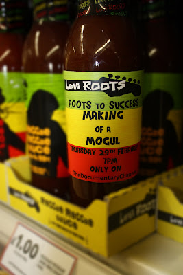
After reviewing the pictures from Tesco to other media students, as well as our Media Studies teacher, myself and Lauren had established that we had further editing to do on our last piece for the advertising campaign. Although the concept was good of having a picture of the modified bottle on a supermarket shelf, others were not convinced that having the blurred out effect was a good idea. Lauren and I then began to edit the lighting on the photos emphasising the writing on the bottle. Here is what we had produced. To enlarge the image, simply click on the image and to enlarge further, simply click on the image again...


Thursday 10 March 2011

Advertising Campaign - Last Part


Using the same method as the test run, shown in the previous post, Lauren and myself had decided to definately use this blurring technique for the last part of our advertising campaign. Our classmates as well as our Media Studies teacher were impressed with this effect. We thought the best place to use this effect would be at a supermarket along side other bottles of Reggae Reggae Sauce. This would be good as a poster because it shows the audience that the product is already well established and has made the shelves of a supermarket. Lauren and myself went to Tesco in Brooklands, Surrey, where we had filmed for part of our documentary before. We went in and asked to speak to Darren who is the head of security, as he was the person who gave us permission to film in Tesco last time. When we went to see him he immediately remembered who we were and allowed us to take photos in the store. When we got to the Reggae Reggae Sauce section, we both alternated in taking photos. We took between fifty and a hundred photos, making the sorting process extremely difficult. The best four pictures that we had found are shown below. The picture on the top is the original, unedited picture and the picture below is the same picture, but an edited version. If you cannot see any of the images clearly, simply click on the image to enlarge, you may then click again to enlarge further:


We were both impressed with all of the images and are currently in the process of choosing which one to use for the final piece of our advertising campaign.

Third And Final Part Of Our Advertising Campaign

For our last advertisment, we decided to use the bottle with the information written on it once again. This is because we believed it to be a clever concept as well as being appealing to the consumer as it is bold and eye-catching. Rather than having a close up of the bottle like we did last time, we thought to have the bottle amongst other things that are blured but having, only the bottle in focus. I placed the bottle in my kitchen cupboard and Lauren took a photo of it using an SLR camera so the image looked clear, crisp and professional. Here is what the image looked like before it had been at all edited:


We then edited the photo on Adobe photoshop CS2. All we did is apply a simple "lens blur" to the whole image. This made the whole image blury. We then used a "history brush" tool on the bottle which brought the bottle back to it's original state. Then we added a brief description at the bottom of the picture. The description is the same as the one on the first supporting piece because we did not want to make them all different, however we realised that we spelt phenomenon wrong! However, this is only a draft and the mistake can easily be rectified.


Here is the edited picture:


Advertising Campaign - Second Poster

Lauren and myself immediately began to plan our second poster. During 2009, I met Levi at a book launch. The book was called "The Reggae Reggae Cookbook." The book looked like this:


In the same way as the bottle, we had decided to change the book cover to produce a poster, however, before we attempted this, myself and Lauren had to seek permission from Levi's PR Agent, Natasha in order to do this. After contacting her she said this was fine for us to do, and confirmed this with our Media Studies teacher.


When we started on this poster, we first scanned a picture of the book and it looked like this:


We then started to edit the book coover, masking all of the writing on the book. This is by using a "cloning tool" found on Adobe Photoshop CS2. Here is a screenshot of us starting this cloning process:


After the cloning process was complete and all of the original text from the book cover was masked, we simply inserted our own text about the documentary and the final result looked like this:


Click on Image to enlarge...


Feedback


The feedback received from this poster was very positive. It has more information on it than the previous poster and in our advertising campaign it would be used as an advert in a TV Guide, rather than a billboard.

Supporting Piece Second Attempt - Feedback

The feedback recieved from other Media Studies students as well as our media studies teacher was very positive. Some of the points they liked about poster was:

  • Crisp photo taken with an SLR camera.
  • White background makes the bottle stand out.
  • The photo is taken at an angle as opposed to straight on. This gives the poster more character and engages the consumer.
  • It was a clever concept to have the title and of the documentary on the bottle.
  • The font used for the description on the side is the same as the font on the bottle so the poster flows better and is easy to understand.

For all of these reasons stated above, myself and Lauren have decided to use this poster as part of our advertising campaign. It is apparent that having the writing on the bottle was a clever concept and we may use the same bottle in another one of our advertisments.

Wednesday 9 March 2011

Documentary Analysis

During the start of the year, all of the students in our media class were required to produce a powerpoint presentation on a documentary. I had done my documentary analysis on, "Michael Jackson - This is It", which is about the excruciating build up of rehersals for the fifty back to back performances at London's O2. I had lost the file that had the presentation on it and have now managed to recover this presentation, which is shown below:


Monday 7 March 2011

First Supporting Piece - Second Attempt!

As mentioned in the last post, myself and Lauren have come up with ways to ammend out first supporting piece. First myself and Lauren removed the label off a bottle of Reggae Regage Sauce and it looked like this:


Click on image to enlarge...


We then placed the label around the bottle and took a photo of it and it looked like this:


Click on Image to enlarge...


Finally, we placed the bottle onto a surface with a white background and took a photo of it with an SLR camera, making the image look much more crisp and professional. Then we simply added in some text with a description of the documentary and the final result looked like this:


Click on image to enlarge...

Wednesday 2 March 2011

Supporting Piece Feedback

After reviewing the first supporting piece with my friends and Media Studies teacher, I was able to see that the first poster myself and Lauren had produced, was not suitable for our supporting piece. This came down to the following reasons:

  • The text did not wrap around the bottle well .
  • The shadowing was too much for the poster and was rather uneccessary.
  • The image as a whole was too dark making the writing hard to read.
  • There is too much information on the bottle and is hard for people to read.

Lauren and myself had a brainstorming session to rectify these problems. We both knew that the general idea was a clever concept but had to come up with ways to make our poster more appealing. We found solutions to tackle our issues with our first supporting piece. These are as follows:

  • To produce our own label to put around the bottle of Reggae Reggae Sauce to make the text naturally curve and wrap around the bottle.
  • To take a picture of the bottle with a crisp white background to keep the poster simple.
  • Keep the image natural without adding any lighting effects as last time it seemed to overpower the poster and make the text harder to read.
  • Put less writing on the bottle and have the description next to the bottle.